

Lifestyle
The real reason why most fast-food chains have red & yellow logos
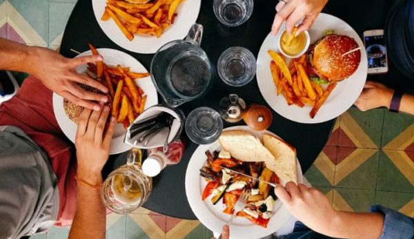
Let’s accept it, fast food is a part of our life.
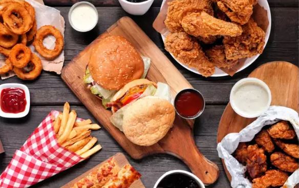
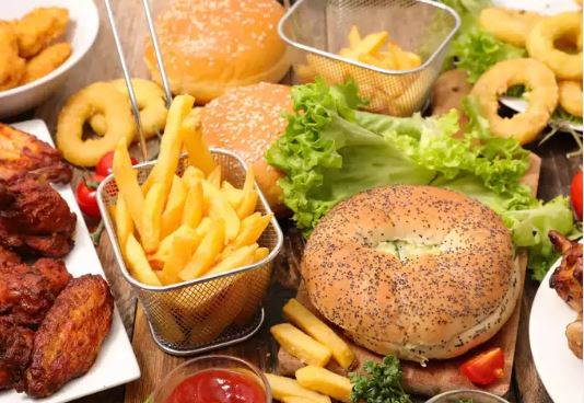
From burgers to fries, and crispy chicken to pizza, we love consuming all these junk foods from our favourite food joints.
These foods are some of the most common ones that one can find across the world in all the fast food joints.
However, it’s not just these, there is one more commonality in these joints. Wondering what it is?
Well, it’s none other than the colour combinations used in the logos of these popular fast-food joints. If you have not thought about it, take a look once again.
Most of these fast food chains have the same shade of yellow and red in their logos, and marketing experts say there’s a very good psychological reason for that.
1. Increases the appetite
The basic reason behind these colour choices is that we tend to crave when we see these two colours together. It increases people’s appetite and this is the only reason why people tend to eat more in fast food joints than their actual hunger. And not just that, there is real psychology behind this theory. Read below to know more about it.
2. The colour psychology
According to colour psychology, the colour yellow has long been associated with feelings of contentment, happiness, competence, and comfort. One simple colour is responsible for that sense of nostalgia and friendliness you feel whenever you pass by those golden arches.
On the other hand, red is the colour that illustrates desire, power, and love. It’s the reason when paired with yellow, a person might suddenly start salivating for a cup of perfectly cooked golden french fries.
When it comes to red & yellow logos, it’s said that red can make people hungry while yellow speeds up your metabolism.
3. The scientific reason
According to science, red is the colour that is associated with being active and can also increase our heart rates. Looking at this colour also increases your heart rate and gives you an appetite. While the yellow colour is associated with happiness. Not just this but yellow colour is easy to spot even in bright daylight. That’s why using the yellow logo helps to easily get spotted, even from distance. According to various studies, half the time people order their food depending on the colour of the product alone. Experts believe that the combination of these two colours gives feelings and emotions that make people hungry.
Conclusion
Red makes you hungry while yellow makes you feel happy, which encourages you to buy food, even when you are not hungry. So if you think, it is just a coincidence that all the fast food chains have their logos painted in red and yellow. You are thinking wrong. There is a strong marketing strategy behind these coloured logos, which makes you eat more than the required amount resulting in obesity.